
Truth Magazine. A magazine worth keeping.
Editorial design and branding for the Christian charity Truth Generation, every issue since 2020.
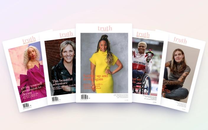
Truth is a faith-filled magazine for women. It began in 2020 at Rebel Hearts Rebel Girls, and today it's published by Truth Generation, a Christian charity helping people discover their identity in Jesus and grow in faith through printed and digital media.
We've been involved from the very beginning, starting with the logo and branding strategy before going on to design the magazine itself. Since then, we've designed every issue, every cover, every page and every file that goes to the printer.
Each issue is full of real stories of transformation, biblical wisdom and practical faith tools, written by and for women making a difference, whether at work, at university or in prison. It's read in four women's prisons and young offender institutions across England, and given to charities supporting women facing homelessness and to student ministries.
The challenge
It started with a conversation with Jane Kirby. Back in 2020, Jane approached us looking for help with a logo and branding strategy for Rebel Hearts Rebel Girls. She had a vision for something that would speak to women, communicate faith and feel relevant to the lives they were living. She needed more than a logo; she needed an identity and a clear direction that could grow with the organisation.
That identity would eventually become the foundation for Truth, a magazine with a purpose beyond its pages. It needed to feel like something you'd pick up in a shop: beautiful, high quality and worth keeping. For many readers, it's a rare thing to hold, so every detail matters.
It also had to work issue after issue. A recognisable look that people would know straight away, but with enough flexibility to make every edition feel fresh and give each new story its own moment.
And it had to be a proper magazine. Each issue carries a £5 cover price, a barcode and an ISSN (the magazine equivalent of a book's ISBN). It's printed on FSC-certified paper and needs to sit happily alongside other established publications on a shelf.
Then there's the range of content. One issue might hold an interview, personal stories, business advice, a poem, an illustration and a page of scripture, each from a different voice. The design needed to bring all of that together without flattening the individuality of each contribution.
The bigger challenge was creating something that could grow beyond a single publication. An identity that could work across the magazine, printed materials, merchandise and other resources, while remaining recognisable and true to its purpose.
Our approach
We treat Truth like a brand, not a one-off. We built a small set of rules that never change, and let everything else move with the story.
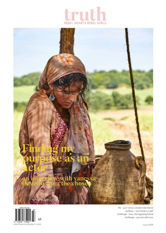
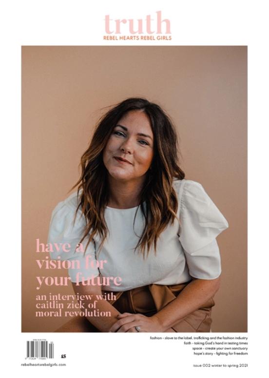
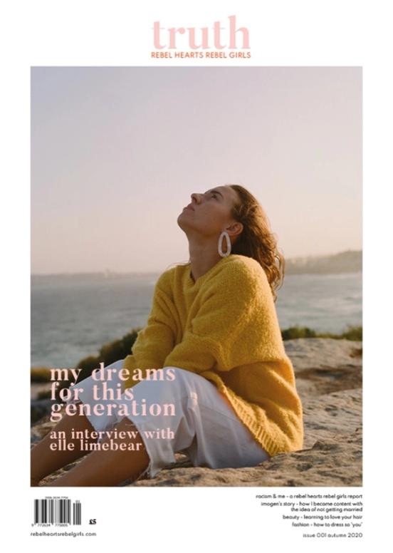
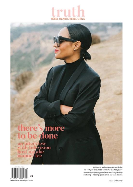
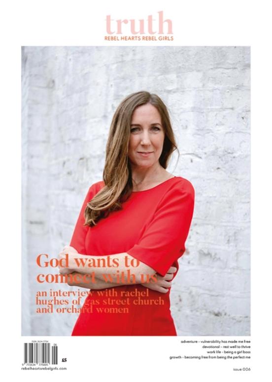
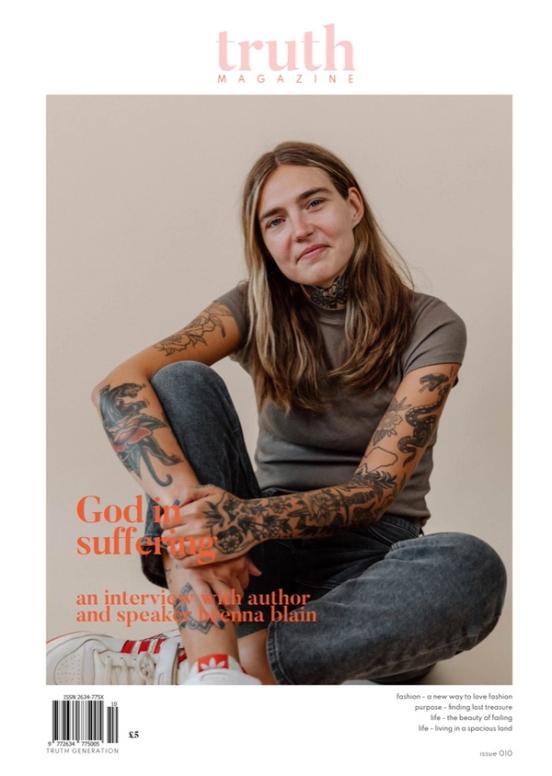
Covers you know straight away
The cover does the most work. It has to catch the eye, say what's inside, and feel like it belongs with every issue before it. A stack of back issues should look like a set.
Every cover follows the same few rules, so the look stays clear while each story gets its moment:
A masthead you'll know anywhere. A soft pink "truth" in a serif, with "Encounter Empower Equip" beneath it, the same every issue.
A woman from the issue on the front. Photographed beautifully and given the whole page.
The cover story, set large. A headline from the interview in a warm serif, with a line underneath saying who she is.
A quiet contents list. Down the right-hand side, the issue's sections in small type: creative, life, business, faith.
Inside the magazine
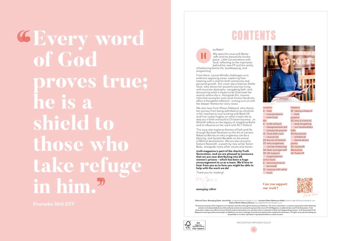
Inside, the same calm approach gives every story room to breathe. Issues open with a full page of scripture, set big in white serif on soft pink. Opposite is the contents page, grouped by section (creative, life, cover story, business, purpose, faith, poetry and illustration), beside a letter from managing editor Jane Kirby, signed off by hand. A QR code asks readers if they can support the charity's work.
Features open with a full-bleed portrait and a pull quote in the woman's own words. Practical pieces use big, coloured serif numerals, so you can follow along point by point. Soft pinks, blues and greens run through as accent colours, with plenty of white space and comfortable body text.
Poems get pages of their own, often paired with illustration. And the back cover shows past issues side by side, with a reminder of why it all exists.
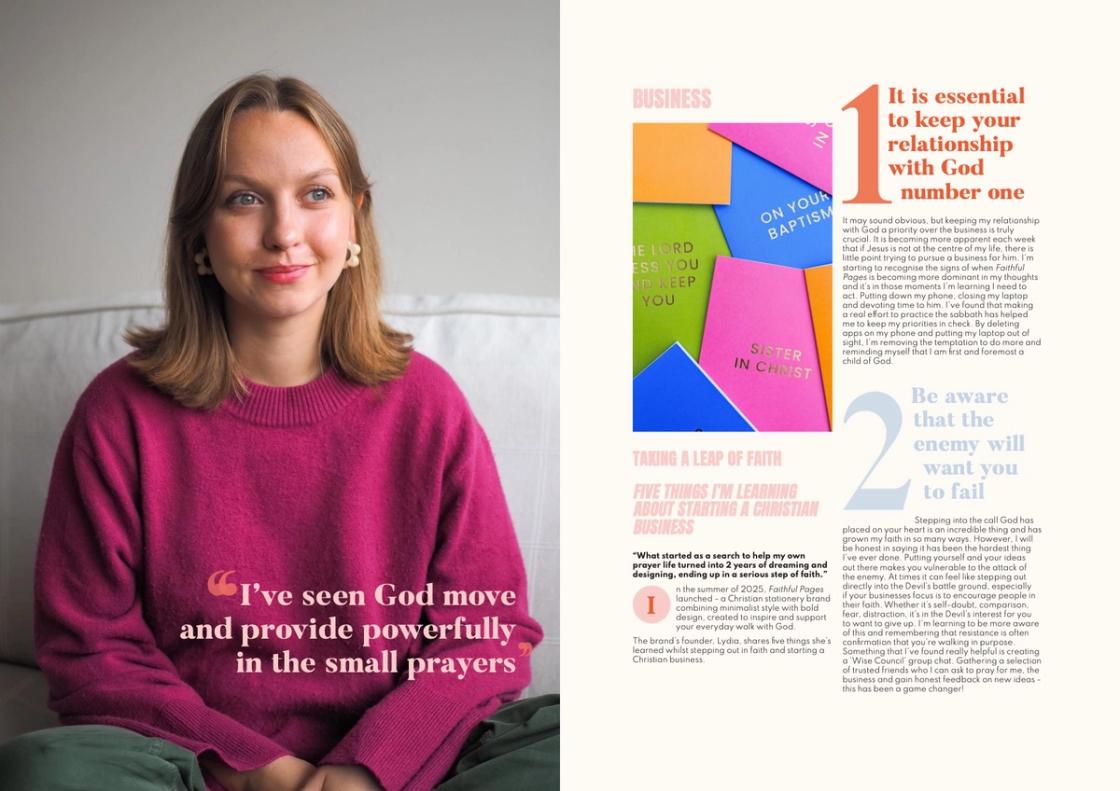
How an issue comes together
Each issue starts with the words. Interviews, articles and poems arrive as documents, along with photos from the contributors. We lay everything out in InDesign, prepare and retouch the photos in Photoshop, and draw any artwork, icons and lettering in Illustrator.
Then come the proofs. We share a PDF, the Truth Generation team marks up their feedback, and we go round again, often several times, until every page is right. Finally, we make two sets of files: a print-ready PDF with everything the printer needs, and a digital edition to share online.
The photos come from lots of places: professional shoots, headshots and snaps sent in by contributors. Part of the job is making them sit together, so a phone photo and a studio portrait can share a spread without either looking out of place.
A master file holds the grids, text styles and pages that come back every issue, like the contents, the editor's letter and the back cover. So each new issue builds on the last, rather than starting from scratch, and our time goes on the stories rather than rebuilding the basics.
Beyond the pages
The magazine is the heart of it, but the look carries further. For Rebel Hearts Rebel Girls, where Truth began, we've also designed the branding and logo, a tote bag, a short book called Be Free From Anxiety, and A5 flyers and postcards.
Keeping all of it with one studio means the magazine and everything around it feel like they belong together. The identity isn't just something that lives on the cover; it's something people can recognise across everything the organisation puts into the world.
The results
We're now on issue 14. Since that first issue in 2020, Truth has kept one clear, recognisable look that still feels fresh every issue.
In issue 13, the charity shared that Truth was now being distributed into UK women's prisons. Today it's read in four prisons and young offender institutions across England, and donated to charities supporting women facing homelessness and to student ministries. For a lot of those readers, it's something of their own to keep.
For the charity, it's a magazine that looks the part wherever it goes, from a women's prison to a student ministry. And when they ask people to support their work, the magazine itself makes the case.
A magazine worth keeping, issue after issue.
Working on the same magazine for years means we know its look inside out. What started with a request for a logo and branding strategy has grown into a long-standing creative partnership, and one we're very proud of.
What it's made possible.
One clear, recognisable look that still feels fresh every issue.
Read by women in four prisons and young offender institutions across England.
Donated to charities supporting women facing homelessness, and to student ministries.